This is a critical review on the website of Martin van Toorn, which was a participant of the BK8030 course in September 2006. The address of the reviewed website is: http://www.martinvantoorn.nl/Â Â
Purpose
The website has a distinct and easily recognizable purpose: it mainly serves as a personal portfolio of Martin’s visualisation- and architectural design work and secondly it also hosts the assignments for BK8030. The main purpose is clearly reinforced throughout the whole site and it’s obvious for the viewer what they should do on the site, namely reading and looking at stills of Martin’s personal design work, not purchasing items or anything else in that matter.
Content
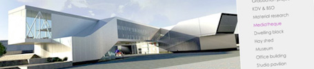
Content should not just be a bunch of pictures or text, content should be useful, helpful, interesting and captivating for the target audience. Martin’s website contains a substantial amount of significant and interesting textual and visual content. Most of the content is focused on his portfolio and there is no unrelated content which could subtract the attention of the visitor. The portfolio is frequently updated with new content, which makes it interesting for the visitor to revisit the website once in a while.
Navigation
The site has a consistent feel and appearance and is easily navigated. A visitor doesn’t need many clicks to find the desired info and the use of scrolling is minimized, nonetheless adding the ability to search the site would be a good improvement. Some symbols or icons that are used for navigation are not always obvious in terms of what they represent, for example the dots on the bottom of the portfolio which are used to scroll through stills of a project do not clearly represent their function at first sight. Secondly textual links are not always recognisable as such because they have the same colour and styling as regular text, a visitor first has to hover over a link with his mouse to be able recognise it. Unfortunately the site also doesn’t support the browsers back-button, which results in leaving the website when pressed.
General
I personally think Martin’s website will be considered as visually appealing by its target audience. The site is constructed of a clean and consistent layout with a white background which doesn’t subtract the visitor from the content. The size doesn’t require scrolling on commonly used screen sizes. The homepage provides a date of the most recent update, but unfortunately is doesn’t provide information on what is actually updated. The site contains a few minor spelling errors and one broken link. Some pages are available in more than one language (English and Dutch) which is useful for native speaking visitors. Sometimes you have to wait a few seconds before the content is loaded, but the overall loading time is acceptable.
As a general conclusion we could say that this is a website with a good look and feel, which could be used as an example for other architectural students and participants of the BK8030 course. Overall mark: 8.0